Briffkase S.A.
Briffkase is a financial service platform designed to support freelancers and small businesses with easy access to expert advice. Through this project, I aimed to redesign the experience to feel less corporate and more human—making financial support feel approachable, flexible, and personalized.
-
Overview
-
client
Personal Project -
My Role
Research, UX Design, UI Design, User Testing, Prototyping -
Duration
65 hours
-
-
The Problem
Freelancers and small business owners often feel overlooked by traditional financial tools, which are usually built for large corporations. These users need tailored, timely support—but current platforms are often too rigid, complex, or impersonal.
The Goal
- Simplify access to financial services
- Personalize the experience based on business needs
- Streamline scheduling and communication with experts
My goal was to redesign Briffkase with three priorities in mind:
Research
Methodologies
- Compartive
- Cualitative
User Interviews
To better understand the needs of freelancers and small business owners, I conducted user interviews with 5 participants. I asked them about their financial challenges, their current financial tools, and their expectations from a financial service platform.
Affinity Map
I gathered insights from user interviews and mapped out patterns using an affinity diagram. Through this process, five clear themes emerged that directly informed my design decisions:
Users crave guidance, not just tools.
Many participants shared how overwhelming it is to manage finances on their own. One said, “I would appreciate help understanding what service is best for me,” while another admitted, “Sometimes it feels like I’m guessing which financial service to choose.” This revealed a need for expert support that’s accessible, simple, and easy to act on — not just a list of options.
Booking should be seamless.
Users expressed frustration with traditional scheduling methods, describing them as slow and inconvenient. “I avoid in-person appointments whenever I can — they just take too long,” said one participant. Another added, “Online booking always seems harder than it should be.” This feedback emphasized the importance of a fast, self-guided flow that adapts to users' schedules.
One-size-fits-all doesn’t work.
Business owners and freelancers in particular want services tailored to their goals, financial stages, and structures. As one participant put it, “I want something that works for how I run my business — not just general advice.” This pointed to a need for flexibility and personalization in how services are presented and recommended.
Trust and clarity are essential.
Across the board, users emphasized the importance of transparent pricing and professional presentation. Comments like “Hidden fees and unclear pricing make me nervous” and “I just want something transparent and easy to understand” highlighted how essential trust is when dealing with financial services.
Digital experience matters.
Finally, users expect modern financial platforms to be intuitive, clean, and helpful — especially when dealing with something as sensitive as money. One user stated, “If it’s not digital, I won’t even consider it,” and another shared, “I need a platform that helps me stay organized.” These expectations guided decisions around layout, structure, and interaction design
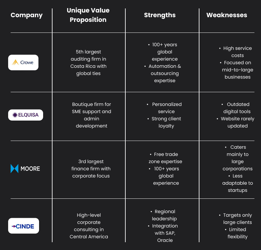
Competitor Analysis
A competitive review revealed that leading firms primarily serve large clients and lack flexible, digital-first services. This highlighted an opportunity for Briffkase to stand out by offering tailored, tech-friendly solutions for smaller businesses.
User Persona
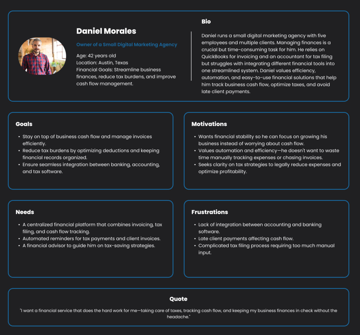
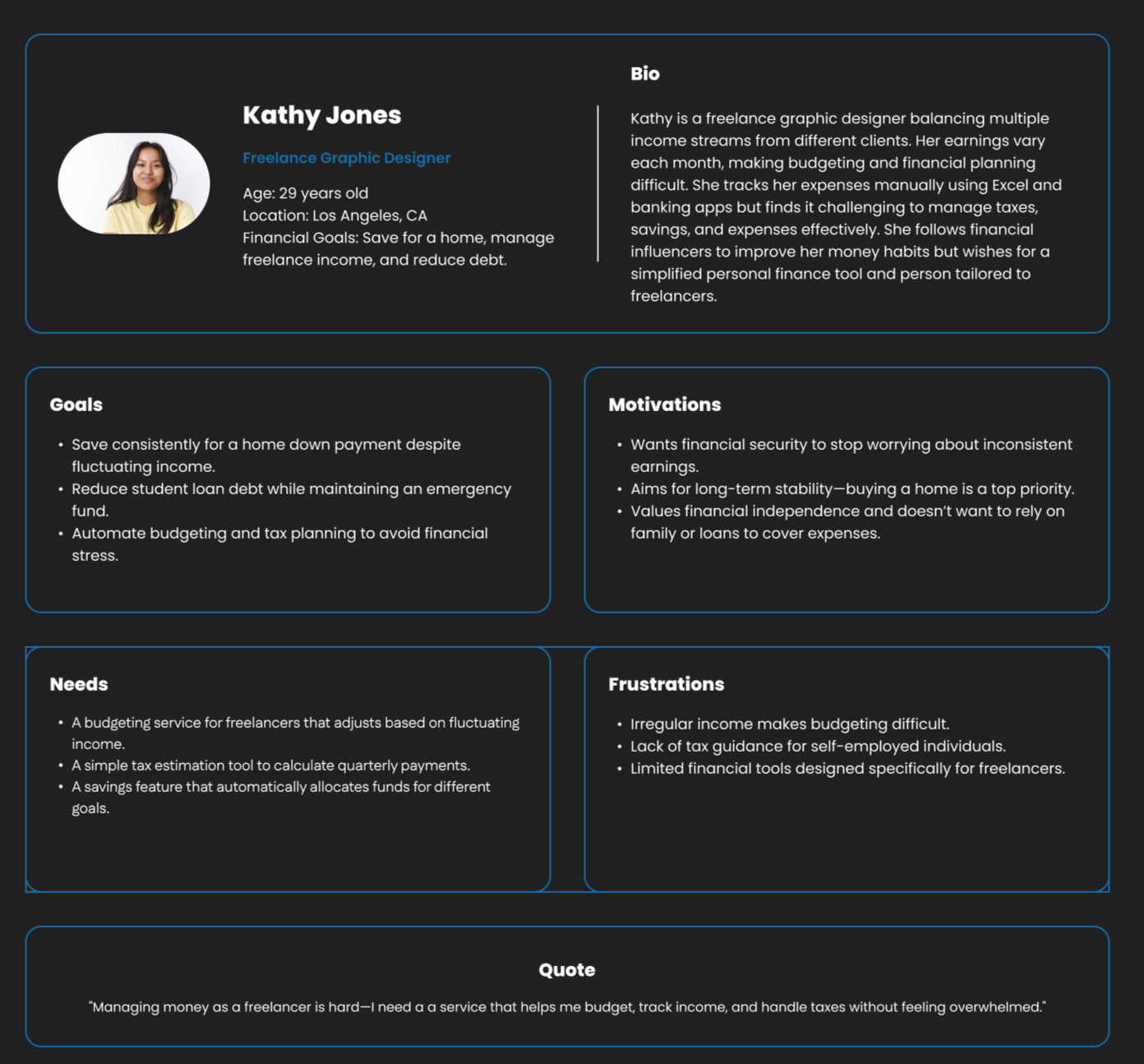
Project Goal
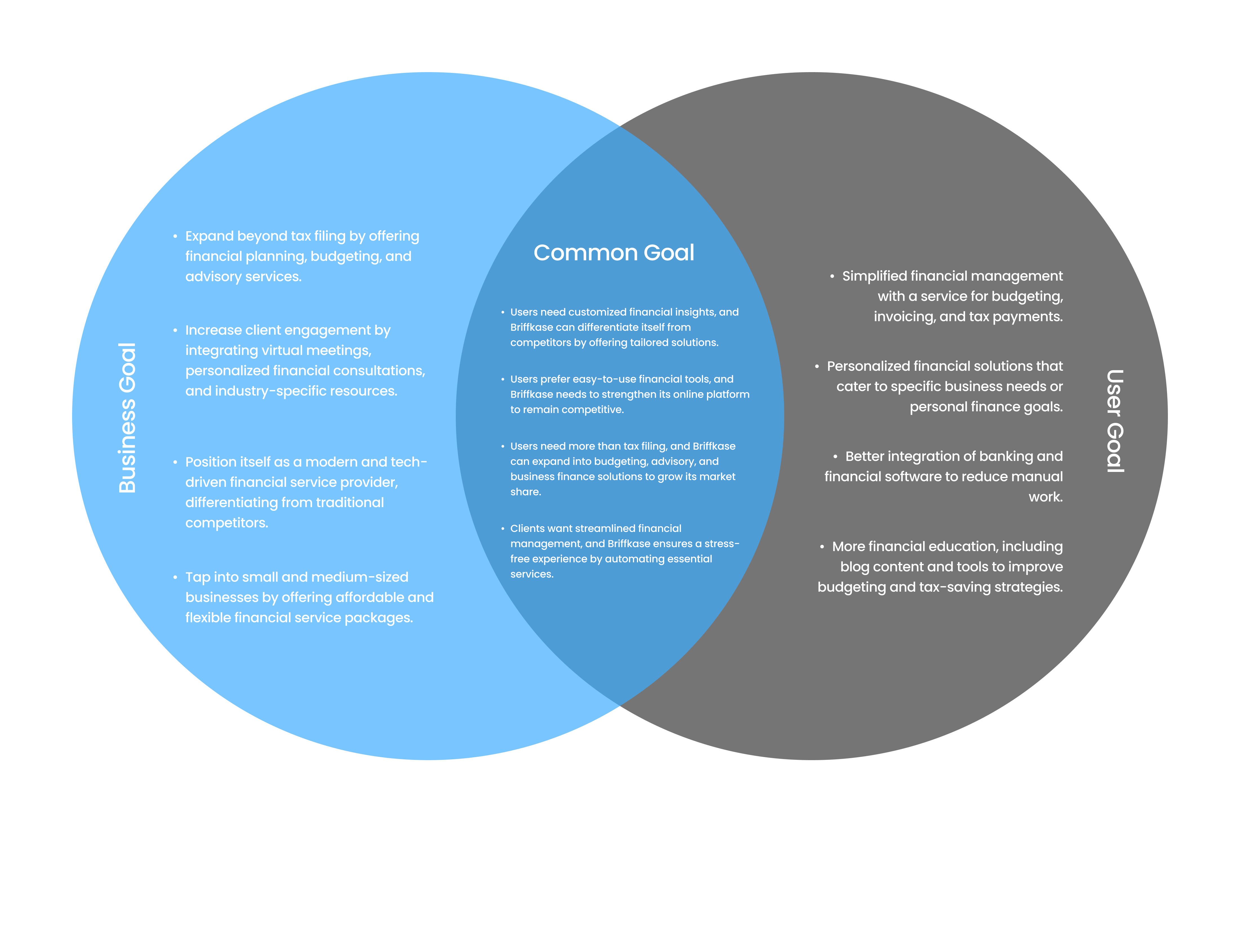
I created this goal alignment map to ensure Briffkase met both user needs and business objectives. Users want simplified financial management, personalized services, and better software integration. The business aims to expand beyond tax filing, increase engagement through virtual consultations, and attract SMBs with flexible packages. Shared goals—like ease of use, automation, and tailored solutions—guided the feature set. Technical considerations like scalability, data security, and user onboarding were also prioritized to support adoption and trust.
Problem Statement
Point of View Statements:
1. Small business owners and freelancers need a financial service that adapts to their unique business structures and cash flow challenges because existing solutions are too generic and fail to meet their specific needs.
2. Users who need financial guidance struggle with limited access to online meetings and real-time consultations, which prevents them from making informed financial decisions and optimizing their tax planning.
3. Clients feel overwhelmed by complex and fragmented financial platforms. They need expert support to handle their finances eciently, ensuring they receive accurate and personalized financial guidance.
How Might We Statements:
1. Design an eortless online meeting experience that connects users with financial experts in real time.
2. Develop a dedicated section on the website where clients can explore financial services, book consultations, and customize their financial support to fit their needs.
3. Ensure that clients can easily connect with financial experts who provide personalized, stress-free support
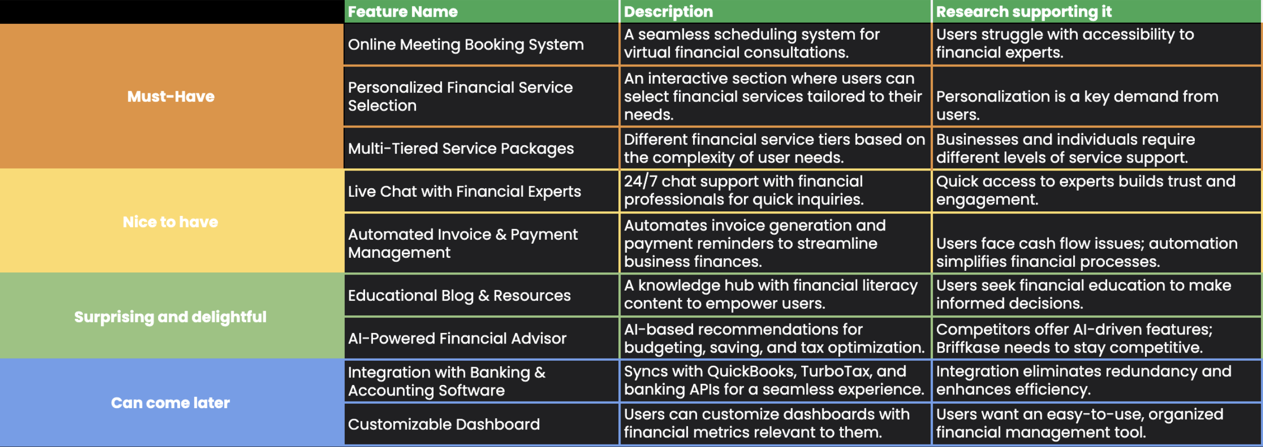
Feature Set
The feature set was crafted to address key user needs around accessibility, personalization, and financial clarity, based on research insights and user interviews.
Design
User Flow
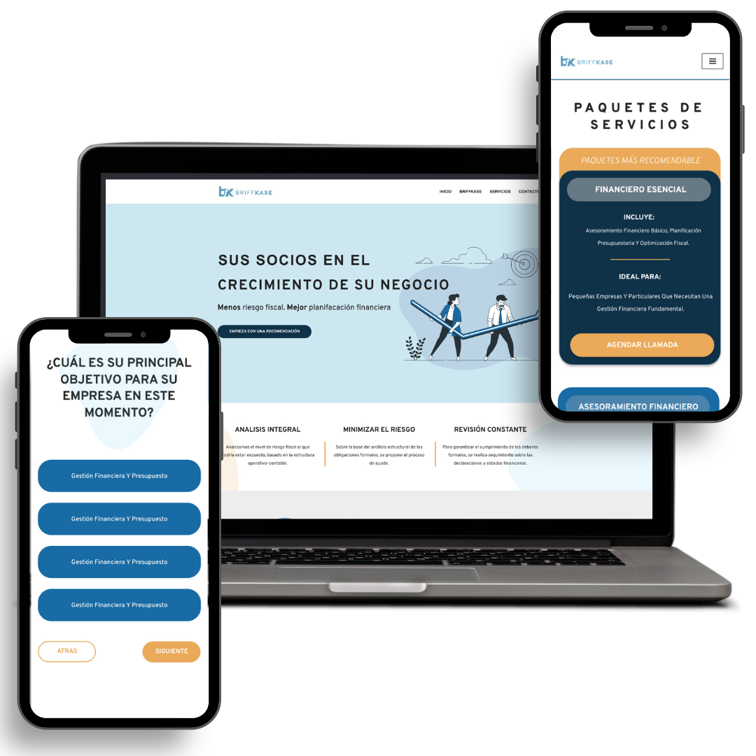
- A recommendation flow that offers users tailored service packages based on a short questionnaire
- A direct booking flow that lets users request expert guidance and schedule meetings easily
I mapped out two user flows:
These flows were designed to prioritize clarity, reduce friction, and support user decisions with confidence.
Wireframe Low Fidelity
The MoSCoW prioritization table was created to guide final design refinements based directly on user feedback gathered during usability testing. In these sessions, participants interacted with low-fidelity wireframes and provided insights on clarity, ease of navigation, and overall satisfaction across three main areas: Questionnaire Flow, Service Package Selection, and Appointment Scheduling.
Must Have items were consistently preferred or requested by nearly all users and address critical usability needs. For example, the point-based progress indicator and single-page scheduling flow were both praised for simplifying the experience and reducing friction.
Should Have items, like the comment box or collapsible sections, were frequently suggested and add meaningful value, though they are not essential for the core functionality.
Could Have features, such as a checklist for prerequisites, were mentioned as nice-to-haves, enhancing the experience but not critical at this stage.
Won’t Have (for now) includes a design concept (one-package-per-page layout) that was explicitly not preferred during testing and would likely create unnecessary complexity.
This table reflects human-centered design thinking—each prioritization decision is tied to user comments, preferences, or observed behavior. By turning qualitative insights into clear priorities, the design team can confidently move into high-fidelity prototyping knowing that the most impactful improvements are being addressed first.


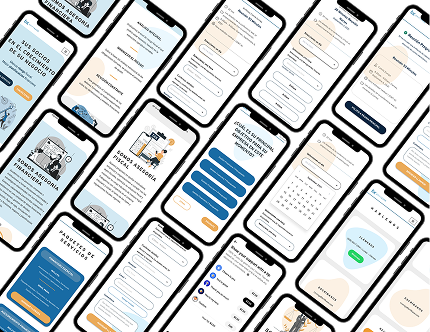
High Fidelity and Prototype
This high-fidelity prototype brings the Briffkase user experience to life, focusing on two main flows: the finance questionnaire and the scheduling process.
The questionnaire screens guide users through a step-by-step flow to gather financial needs, while the scheduling interface allows them to select time blocks and confirm meetings—all with a clean, professional, and approachable design.
The visual style uses a calming color palette and clear typography to promote trust, clarity, and ease of use for busy freelancers and small business owners.
UI Kit - Design Language System
This UI kit was created to support the Briffkase financial services platform, ensuring a cohesive, modern, and trustworthy user experience throughout the product. It reflects the platform's goal of being professional, approachable, and clear.
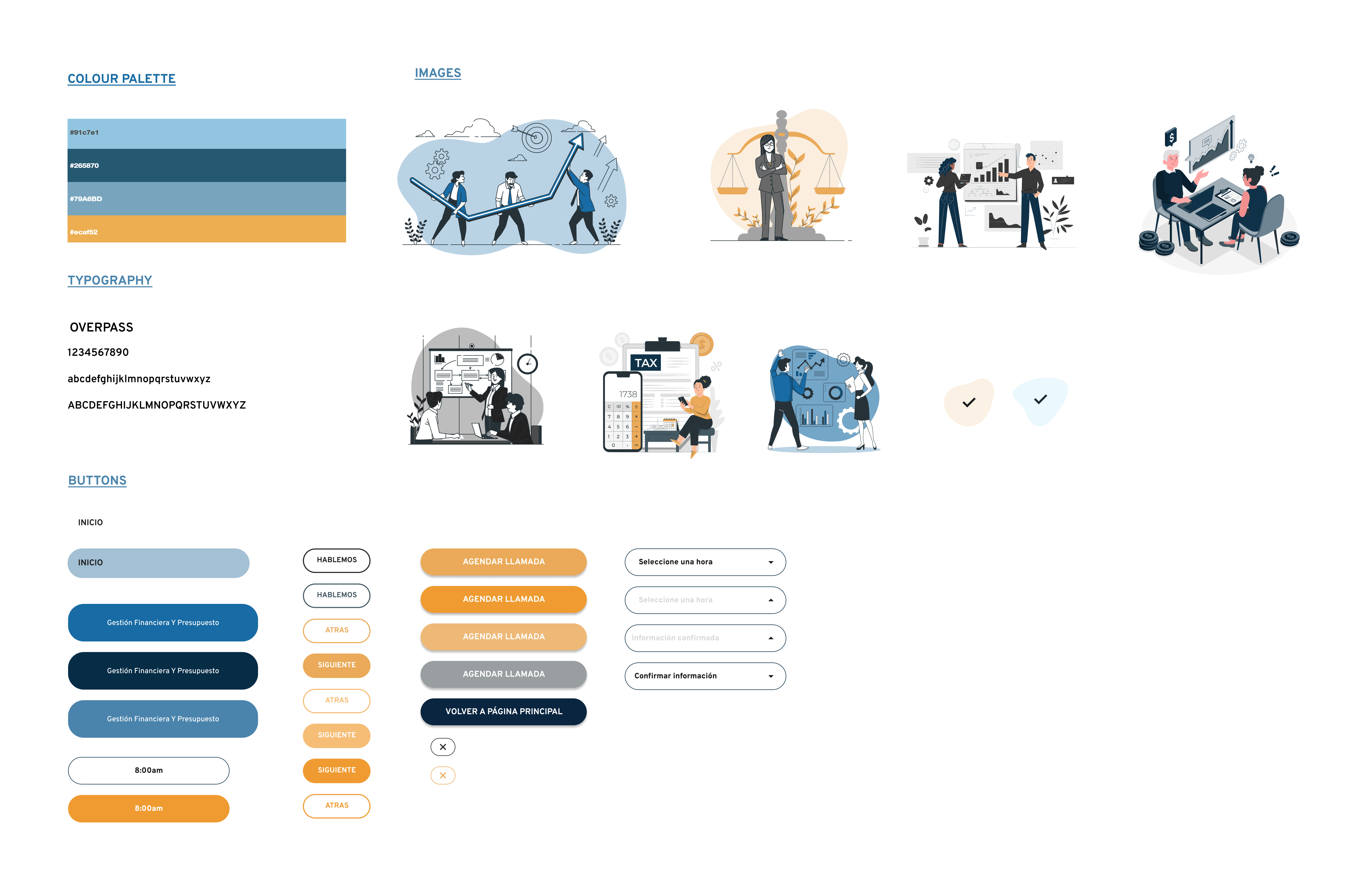
Colour Palette
The selected color scheme combines cool blues and a vibrant accent yellow to communicate trust, clarity, and energy. The muted tones give the interface a calm and reliable feel, while the yellow provides contrast and draws attention to key actions.
Typography
The UI uses the Overpass typeface—a clean, modern sans-serif that supports readability and gives the interface a structured yet friendly tone. It's consistent across all headers, body text, and input fields.
Buttons & Inputs
Buttons follow a clear hierarchy using color and style (filled, outlined, and ghost) to guide user action. Common actions like “Agendar llamada” and “Volver a página principal” are styled for visibility and consistency. Input fields and dropdowns are simple and intuitive, supporting a smooth booking and form-filling experience.
Illustrations & Visuals
Custom illustrations are used to make financial topics more approachable and engaging, helping users feel more comfortable with complex tasks like budgeting or taxes. They add personality and support onboarding, empty states, and learning moments.
-
Testing
-
Participants
5 Users -
Method
Remote moderated sessions -
Test Duration
About 15 minutes per user
-
-
What Went Well
- Users found the platform clean, easy to navigate, and professional.
- The single-page booking flow was smooth and well-received.
- The recommendation questionnaire was appreciated for its personalization.
- Asynchronous communication options (email/WhatsApp) were preferred.
- Removing the checkout step streamlined the booking process.
Pain Points
- The questionnaire was hard to find; users wanted it more visible and clearly labeled.
- Dropdown menus lacked clarity and intuitive structure.
- Recommended packages weren't visually distinct enough.
- The scheduling flow lacked a strong confirmation step or visual feedback.
Iterations
When I moved into the high-fidelity stage of the Briffkase project, I made several design decisions based directly on what I observed during user interviews and usability testing. My goal was to reduce friction and make the experience feel more intuitive and helpful for users.
1. Homepage CTA Update
One of the first issues I noticed was that users weren’t finding the questionnaire feature easily. The homepage originally had two buttons — “Nuestros Servicios” and “Contáctenos” — but they weren’t driving engagement.
So, I simplified this by replacing both with a single CTA: “Empieza con una recomendación.”
This made it much clearer what users should do next and encouraged them to start the experience with a personalized recommendation.
2. Renaming the Questionnaire
Another small but important change was renaming the questionnaire. “Cuestionario” felt too generic and didn’t communicate the value behind it. I changed it to “Empieza con una recomendación” and made sure to use this consistently across the interface — in the navigation and header.
This helped set the right expectation and made users more curious and willing to engage.
3. Highlighting the Recommended Package
In the service selection screen, users were having trouble identifying which package was actually recommended — even though there was a label.
To solve this, I dimmed the other packages slightly and visually emphasized the recommended one. I also added hover effects to make it easier for users to explore other options without feeling overwhelmed.
This gave users clear direction while still giving them flexibility.
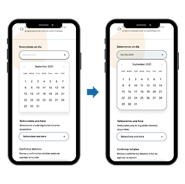
4. Improving the Scheduling Flow
The scheduling flow also needed refinement. Users felt that the dropdown menus were hard to understand — the labels looked disconnected and it wasn’t clear what to click on.
I adjusted this by moving the labels closer to the dropdowns and adding a filled background when a dropdown was active.
These subtle changes really helped make the process smoother and more user-friendly.
5. Final Thoughts
Each of these changes was simple but made a big impact. They were all based on real user feedback, and they helped make the platform feel easier to use, more personalized, and more trustworthy.
The final version feels clearer, faster, and overall more aligned with what users actually need from a service like Briffkase.
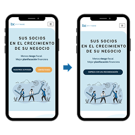
Replaced both with a single, clearer CTA — “Empieza con una recomendación” — to drive attention and improve feature visibility.
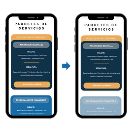
Visually emphasized the recommended option by dimming others, highlighting the suggested one, and adding hover effects to encourage easy exploration of alternatives.
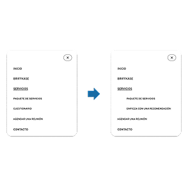
“Empieza con una recomendación”, a more action-oriented phrase that clearly communicates its benefit and is consistently used across navigation and headers.
Improved clarity by moving input labels closer to dropdown titles and adding a filled background to highlight active dropdowns.
Final Project and protoype
The final Briffkase prototype showcases a streamlined, mobile-first experience tailored for freelancers and small business owners.
The design focuses on clarity, accessibility, and trust—using clean layouts, soft tones, and improved micro interactions to guide users smoothly from discovery to booking
This project taught me the importance of pairing clarity with flexibility—especially when designing for users navigating complex topics like finances. I'm proud to have created a solution that feels human, supportive, and approachable for those who need it most.