Doordash
DoorDash holds the largest market share in the U.S. and appeals to users looking for food and grocery delivery in urban and suburban areas.
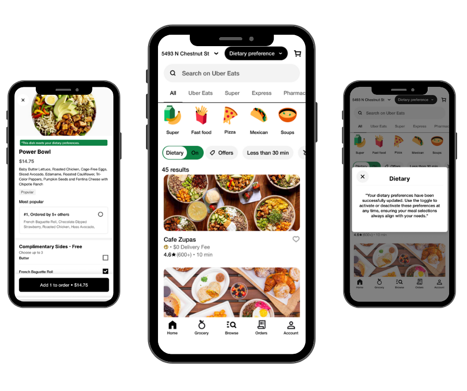
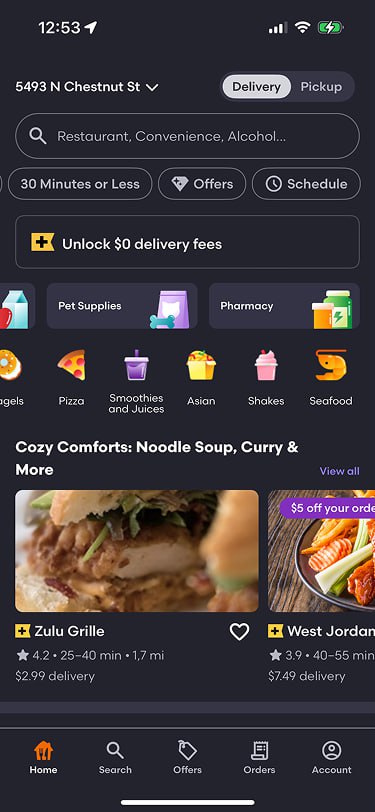
Ordering food should be simple—but for users with dietary restrictions like keto, gluten-free, or dairy-free, it often becomes a frustrating experience. This project focused on redesigning the Uber Eats experience to make dietary filtering easier, faster, and more personalized for users with specific needs.
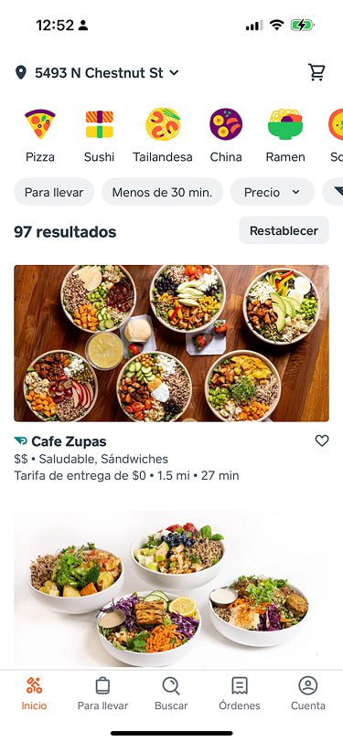
Uber Eats lacks intuitive filtering for users with dietary needs, leading to wasted time, second-guessing ingredients, and an overall poor browsing experience.
Introduce a personalized dietary filter system that allows users to:
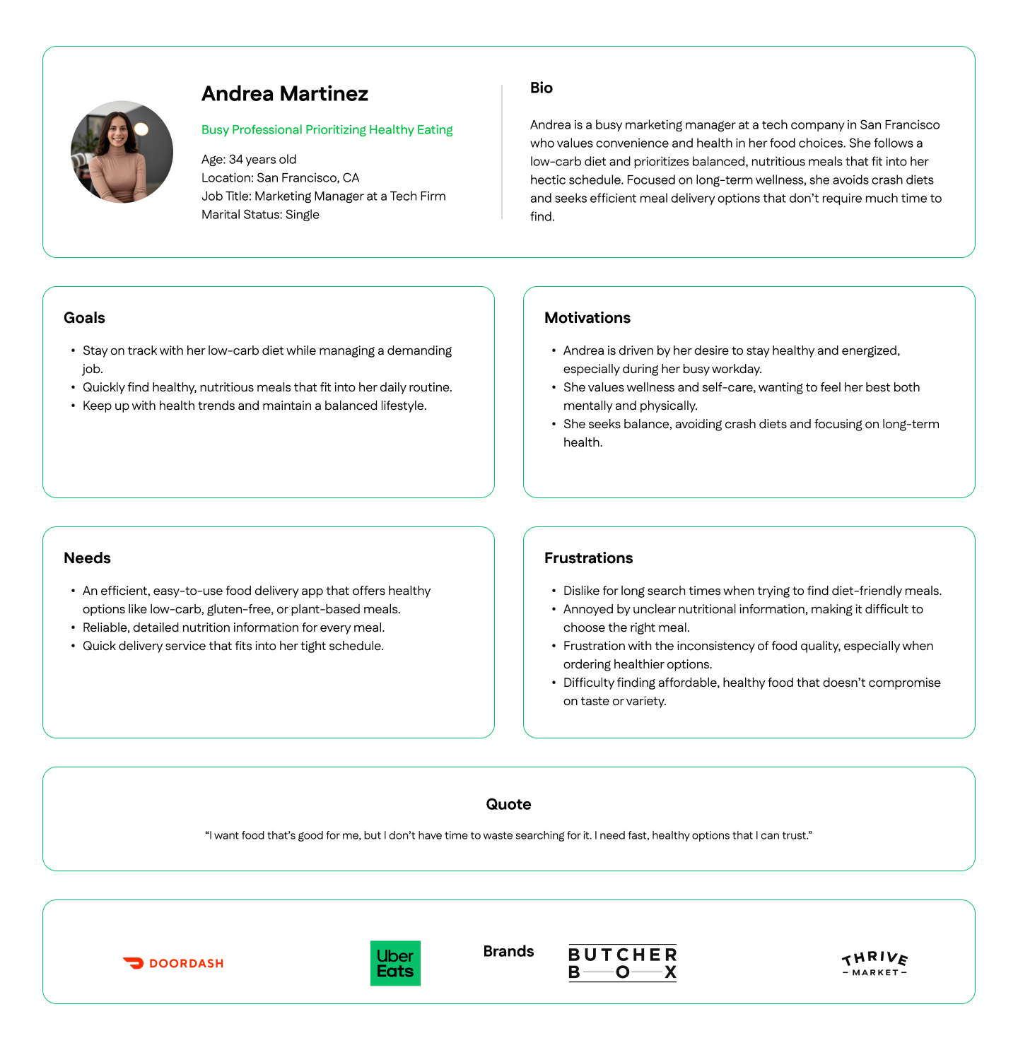
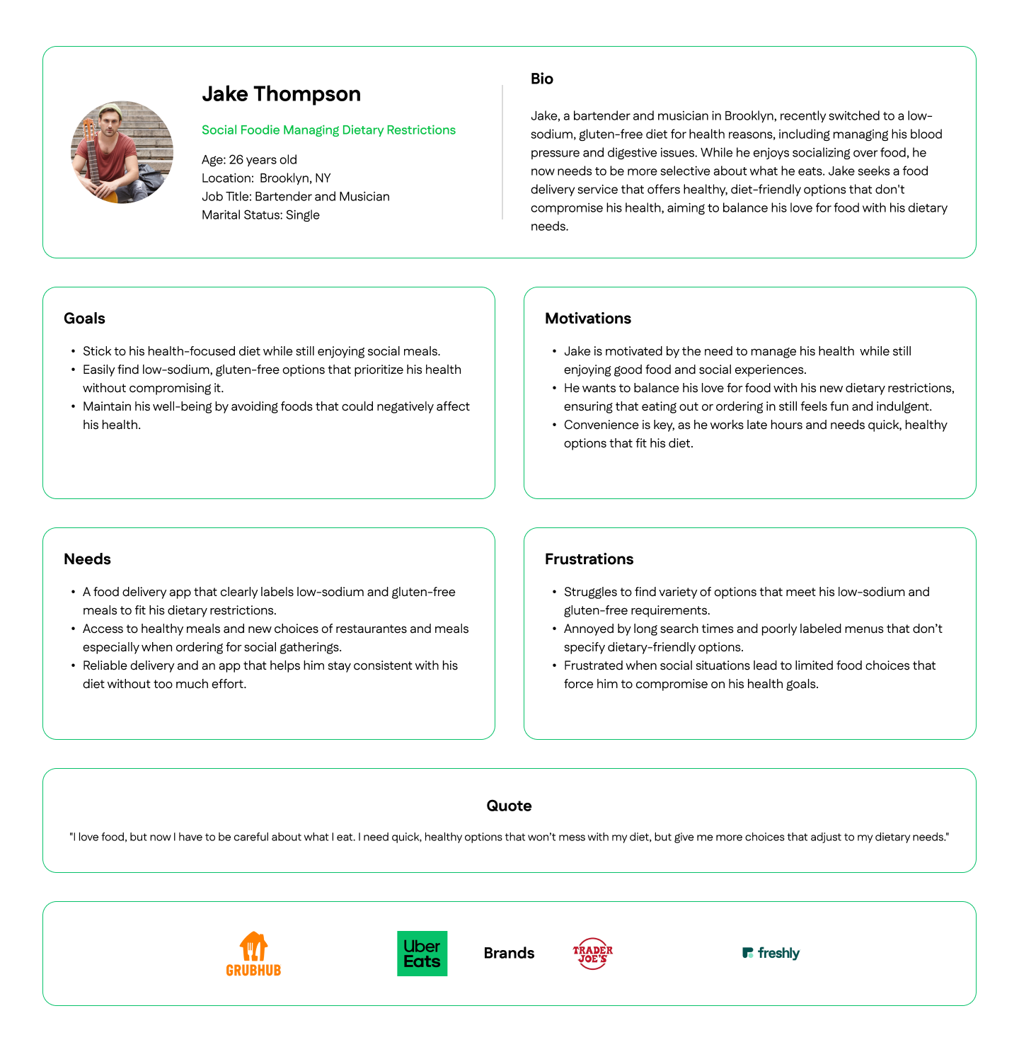
To understand user needs, I conducted interviews with individuals who follow specific diets like keto, vegan, dairy-free, or gluten-free. They shared a common pain point: current food delivery apps make it hard to find meals that match their restrictions.
User interviews revealed a strong demand for personalization in food delivery. Users want quick ways to apply dietary filters, confidence in ingredient transparency, and the ability to save preferences to avoid repeating the same steps.
I paired these insights with a detailed competitor analysis, reviewing platforms like DoorDash, Grubhub, and Caviar. While these apps offer a variety of features, none fully addressed the need for easy, diet-specific filtering.
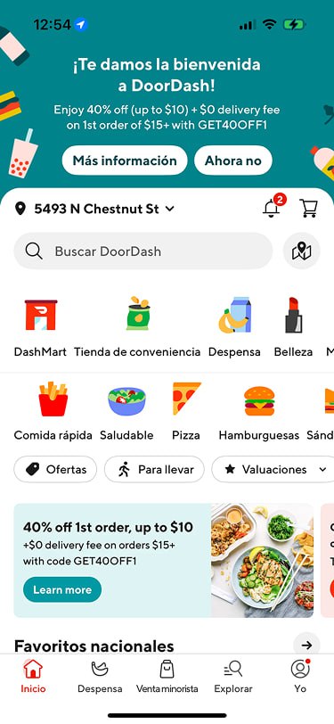
Doordash
DoorDash holds the largest market share in the U.S. and appeals to users looking for food and grocery delivery in urban and suburban areas.
Grubhub
Grubhub is known for its strong partnerships with local restaurants, especially in urban markets.
Caviar
Caviar focuses on premium, gourmet dining experiences, targeting urban foodies who prefer quality over convenience.
I created this goal alignment map to support the design of a dietary filter feature for Uber Eats. Users want an easy, accurate way to find meals that match their dietary needs, while Uber Eats aims to boost engagement and reach health-conscious audiences. The shared goal is a smooth, personalized ordering experience that saves time and builds loyalty. Technical considerations like filter scalability, clear labeling, and data privacy were key to ensuring a seamless and trustworthy user experience.
Point of View Statement:
Health-conscious users need a faster, more personalized way to find meals matching their dietary needs on Uber Eats. Without dietary filters and clear labeling, it's challenging for them to quickly discover suitable options, reducing their engagement and loyalty.
How Might We Statement:
How might we create a personalized dietary filter that streamlines the meal search experience, enabling health-conscious users to easily find meals that meet their specific dietary preferences?
This feature set was chosen to help users with dietary needs quickly find suitable meals, based on research showing demand for personalized, health-conscious options. The must-have features ensure accurate filtering, clear tags, and customizable profiles for a smoother experience. Nice-to-have features like ingredient exclusion and advanced search give users more control. Delightful extras like personalized tips and reviews build trust and engagement. Future features like nutritional info and promotions can be added later to enhance the experience even more.
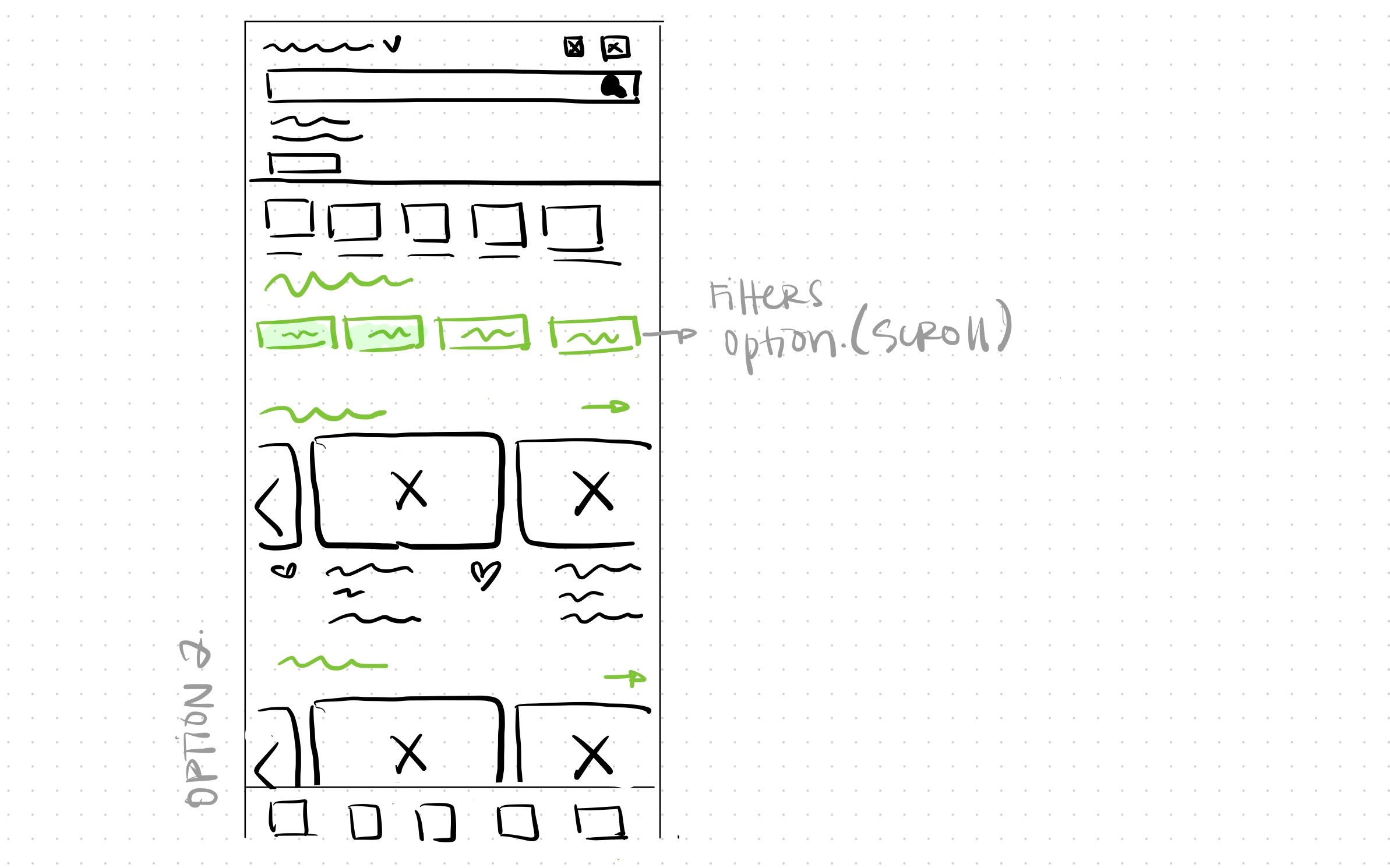
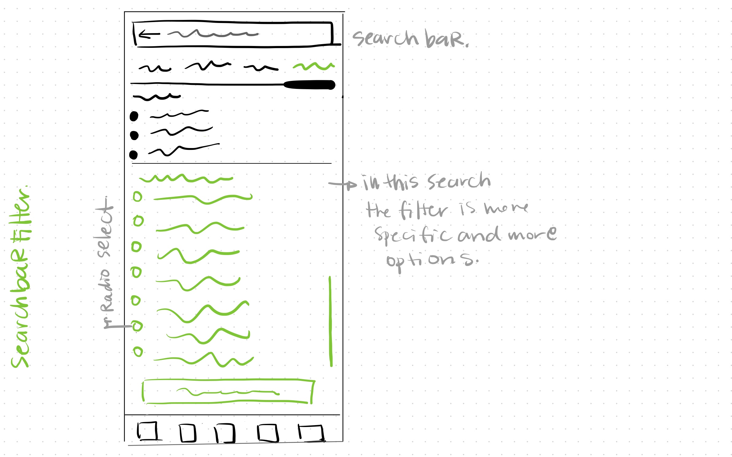
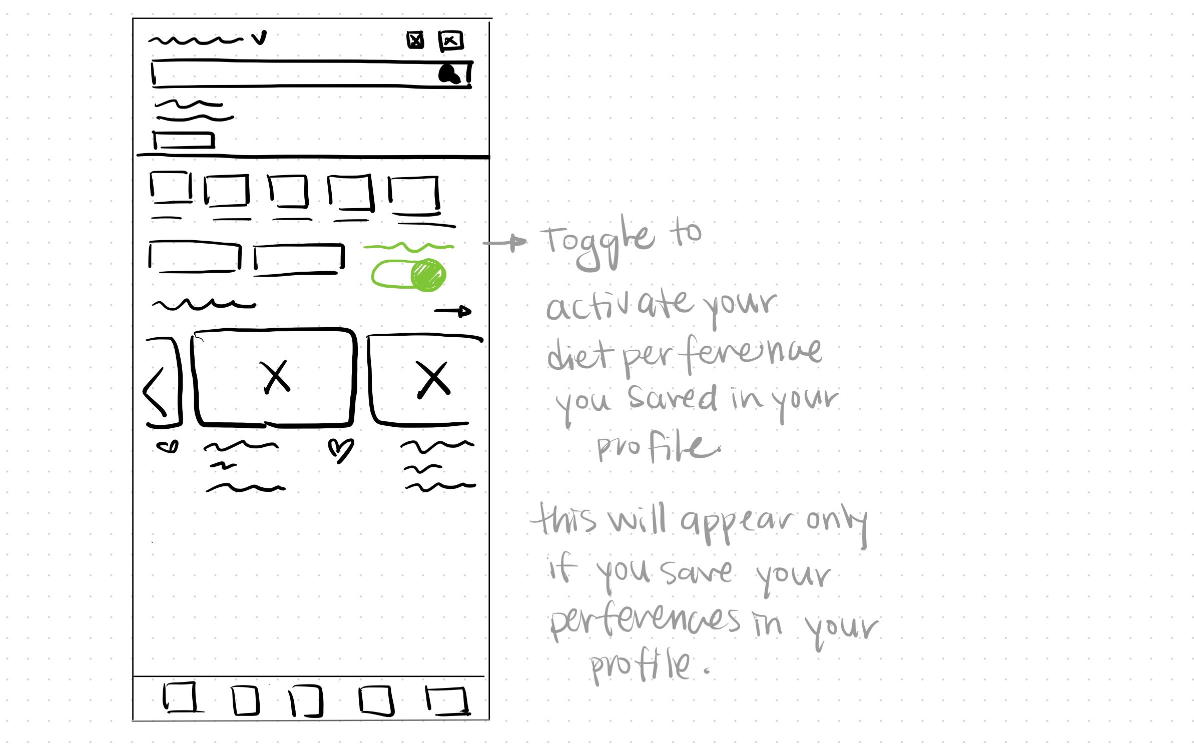
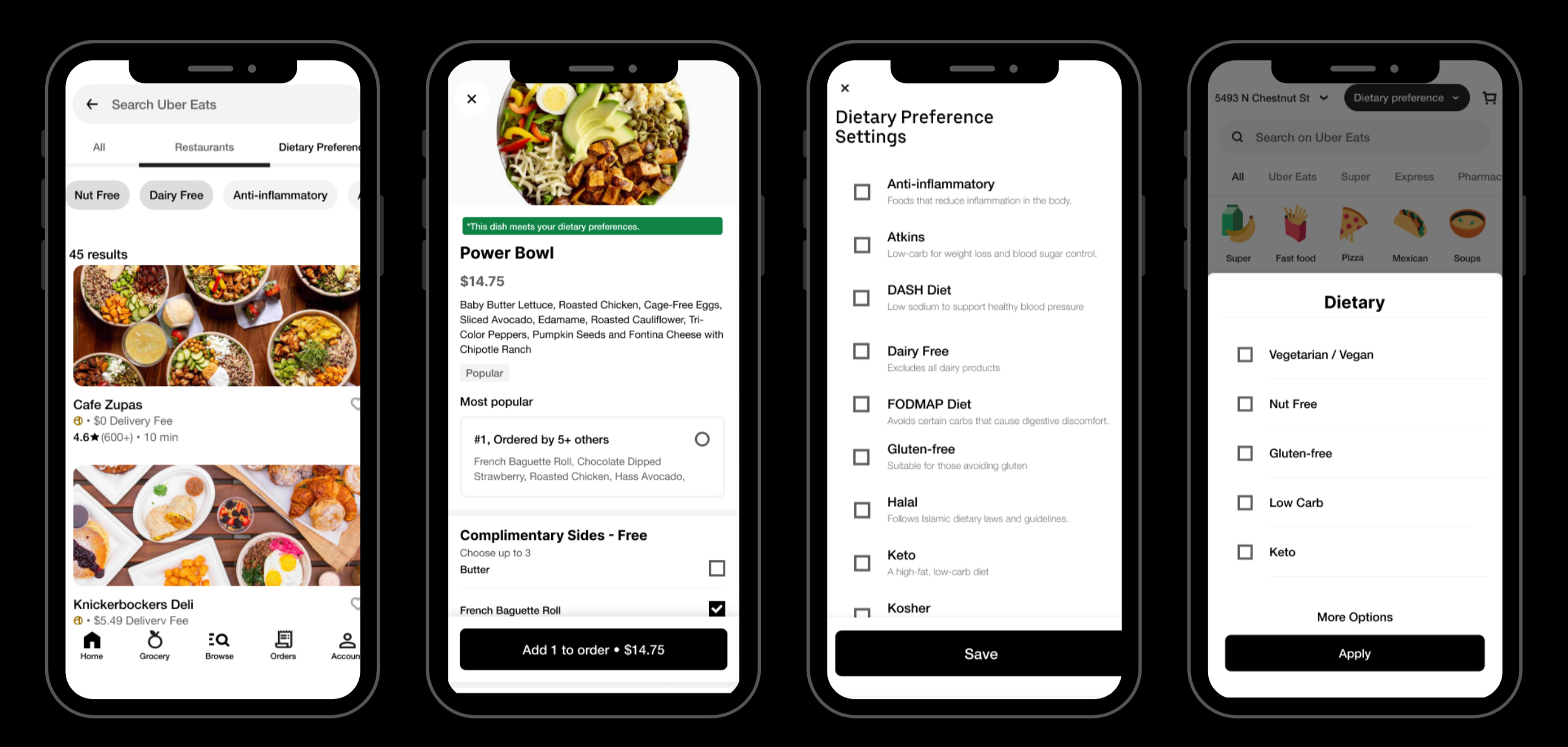
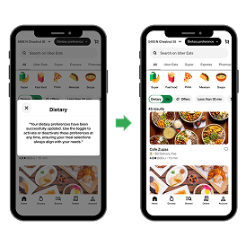
This user flow illustrates the process of adding a dietary restriction filter to a food delivery app. It covers both quick filtering for immediate searches and personalized dietary profile setup for faster future orders. The flow ensures users can easily find meals that meet their dietary needs, make confident selections, and proceed smoothly to checkout.
To improve the experience for users with dietary restrictions, I introduced several key features in the wireframes:
These features aim to make filtering faster, easier, and more personal.
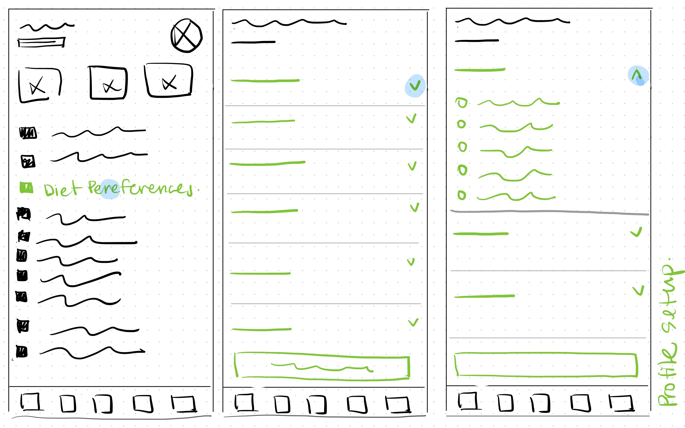
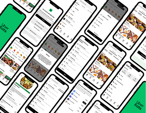
During the high-fidelity and prototyping phase, I designed clean, user-friendly screens that integrated the new dietary filter seamlessly into the Uber Eats interface. The prototype included key flows such as setting up dietary preferences, filtering meals, and confirming whether a dish matches user needs.
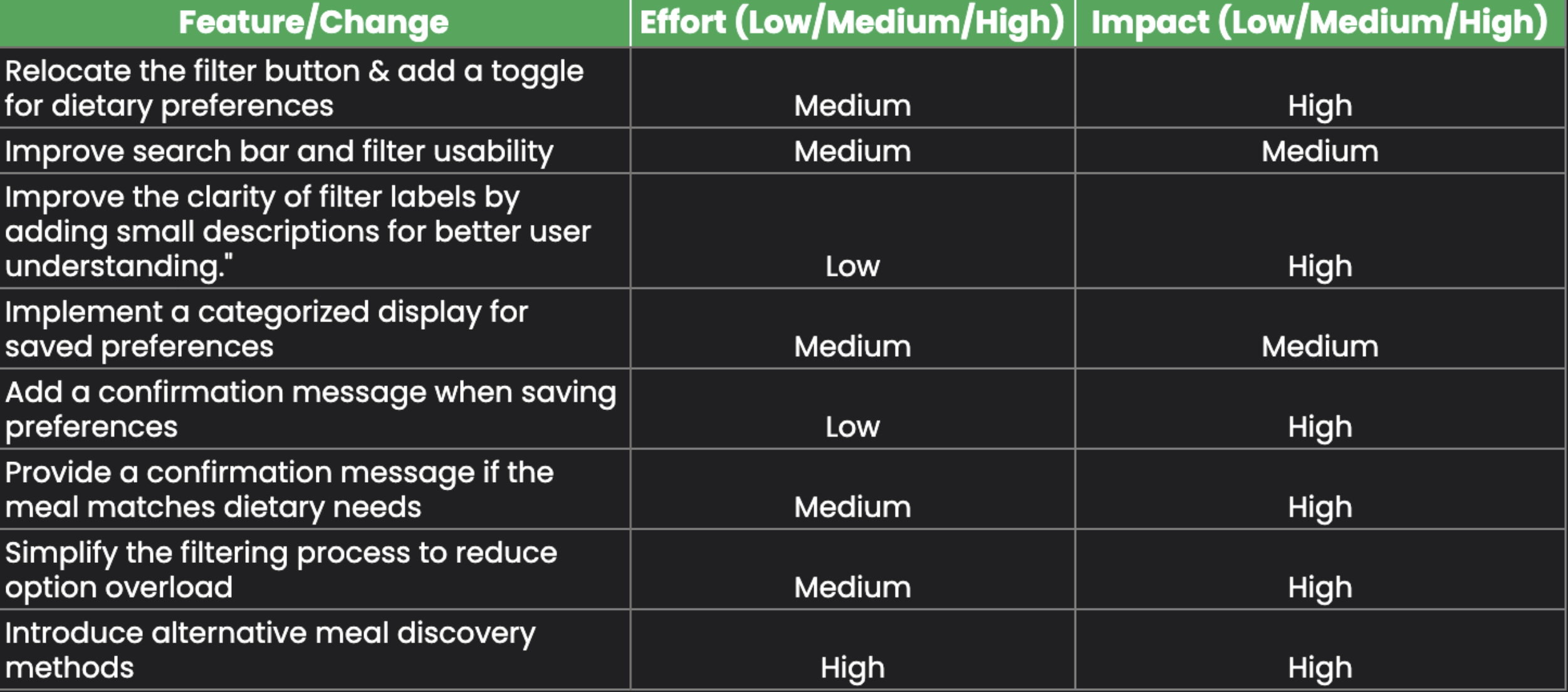
Based on the user testing interviews, this table summarizes and prioritizes feature updates aimed at improving dietary filtering and meal discovery. The focus is on enhancing clarity, usability, and user confidence when selecting meals.
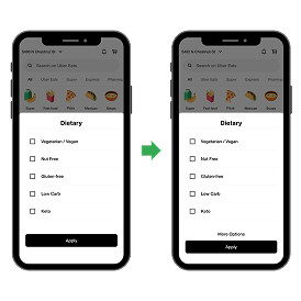
Added a “More Options” button to simplify the filter view and reduce visual clutter.
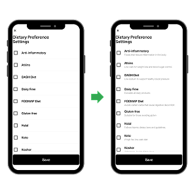
Added short explanations to filter options to help users understand them at a glance.
Introduced a pop-up message to confirm that dietary preferences were saved successfully, giving users reassurance.
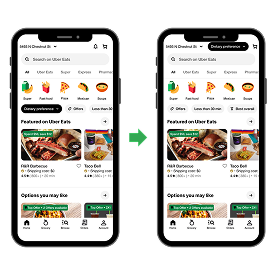
Made the dietary filter easier to find by moving it to the top of the homepage
This high-fidelity prototype showcases the proposed dietary restriction filter integrated into the Uber Eats app. It includes key screens for onboarding, dietary preference selection, meal filtering, and personalized profile settings—designed to enhance the user experience with a clean interface, intuitive navigation, and faster access to diet-friendly meals.
One of the biggest challenges was balancing simplicity with the need for detailed dietary information. Users wanted quick filtering, but also needed confidence that a meal truly matched their restrictions. Designing an experience that was both fast and informative required careful prioritization of layout, language, and visual hierarchy.
I learned how vital clarity and trust are when designing for people with specific needs. Even small moments—like confirming that a meal meets a dietary filter—can make or break the user experience. Personalization and reassurance matter just as much as functionality.
If I had more time, I would explore ways to integrate more dynamic personalization, such as AI-based suggestions or auto-filtering based on past orders.
I'm proud of designing a feature that supports real, everyday needs. This solution doesn't just make ordering easier—it helps users stay consistent with their health goals and feel seen in a platform that wasn't originally built for them. Creating that kind of impact through design is what I love most.