Glow On
As someone who values both beautiful design and everyday convenience, I set out to create GlowOn—a mobile-first beauty salon app that makes self-care effortless. The idea came from a simple insight: many salons still rely on outdated booking methods like phone calls and social media DMs, which often lead to missed appointments and a frustrating client experience.
I envisioned something smoother, smarter, and more user-friendly. Something that would help users manage beauty appointments and recurring services with ease—right from their phones.
-
Overview
-
client
Personal Project -
My Role
Research, UX Design, UI Design, Branding, User Testing, Prototyping -
Duration
100 hours
-
-
The Problem
During my research, I discovered a recurring pain point: users wanted more control over their salon experiences. They were tired of back-and-forth messages, unclear service options, and inconsistent booking confirmations.
Salons, on the other hand, were missing out on loyal clients due to these inefficiencies. There was a clear gap in the market—no mobile app offered salon-specific subscriptions and streamlined scheduling in one place.
The Opportunity
What if users could: Browse services, pick a stylist, and book in minutes? Subscribe to their favorite treatments on a regular basis? Enjoy special deals, loyalty perks, and instant confirmations?
What if users could: Browse services, pick a stylist, and book in minutes? Subscribe to their favorite treatments on a regular basis? Enjoy special deals, loyalty perks, and instant confirmations?
Research
Methodologies
- Compartive
- Cualitative
User Interviews
To validate the idea, I interviewed 5 users who regularly book salon services
Affinity Map
- "I think apps should centralize everything so we don't have to jump between platforms."
- "It's easier when you can see your booking, plan, and perks all in one app."
- "I always pay through the app — I like getting the receipt right away."
- "The app should let me choose my payment method and save it."
- "I like apps that make booking super easy — no back-and-forth."
- "Rescheduling should be simple; life happens!"
- "The app should send a message the day before so I don't forget."
- "You should be able to pause or adjust your plan without calling anyone."
- "I love when the salon feels clean and welcoming."
- "If they offer eco-friendly options, I'm more likely to book again."
Using affinity mapping, I surfaced the most common user needs and pain points by analyzing comments across all interviews. These insights helped me understand what matters most to users and how to guide design decisions.
A Centralized Place for Bookings, Payments, and Promotions
Many participants wanted to manage everything in one place — from appointments to payment and deals.
This showed a strong desire for a streamlined experience that doesn't feel scattered or disconnected.
Digital Payments with Access to Receipts
Payment flexibility and proof of transaction were essential to users.
This insight highlights the importance of secure and visible digital transactions.
Simple, Stress-Free Scheduling
Booking appointments should be quick and flexible.
These comments emphasize the need for a smooth, mobile-first calendar and clear scheduling logic.
Strong Communication, Reminders, and Plan Management
Users want timely reminders, updates, and control over their subscriptions.
This highlights a strong expectation for automation, personalization, and independence.
A Desire for Friendly, Eco-Conscious Salon Environments
Several users shared how important atmosphere and values are.
While not core functionality, this insight helps shape the brand tone and values reflected in the UI
Competitor Analysis
Conducted a competitor analysis of platforms like Booksy, Vagaro, and Ottalaus Salon.
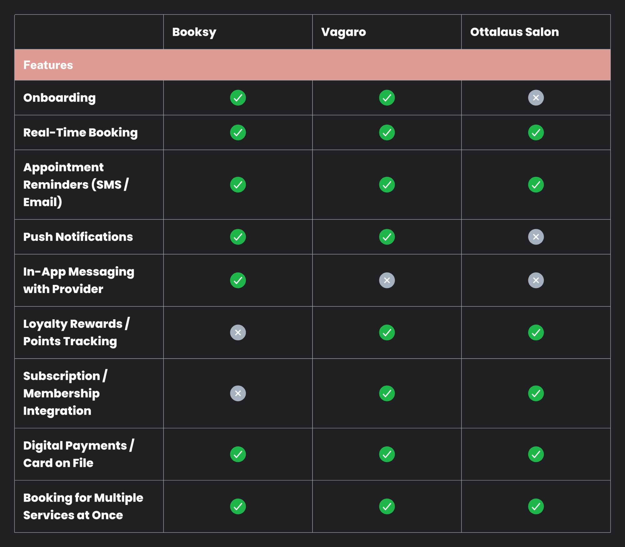
During my competitive analysis, I discovered that while Ottalaus Salon embraces a subscription-based model and focuses on client retention, it completely lacks a mobile app—limiting accessibility and convenience for modern users.
On the other hand, platforms like Booksy and Vagaro offer a wide range of features, but they're designed for broad service industries, not specifically tailored to beauty salons or the unique value of subscription plans.
This revealed a clear market gap—there was no mobile app offering salon-specific services combined with built-in subscription options from the client's perspective.
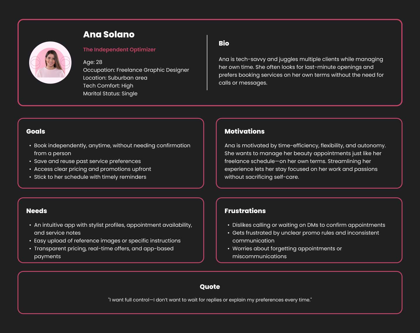
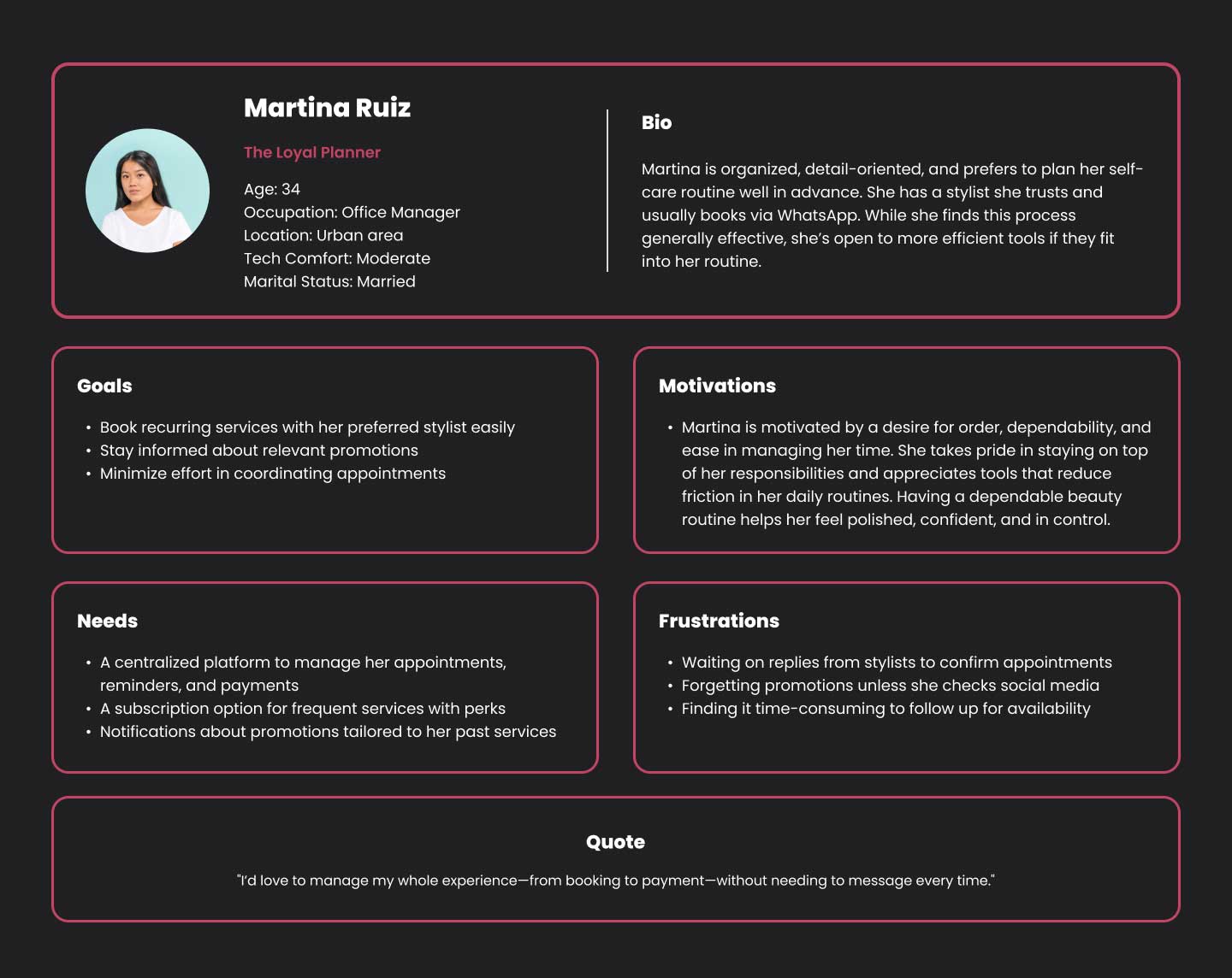
User Persona
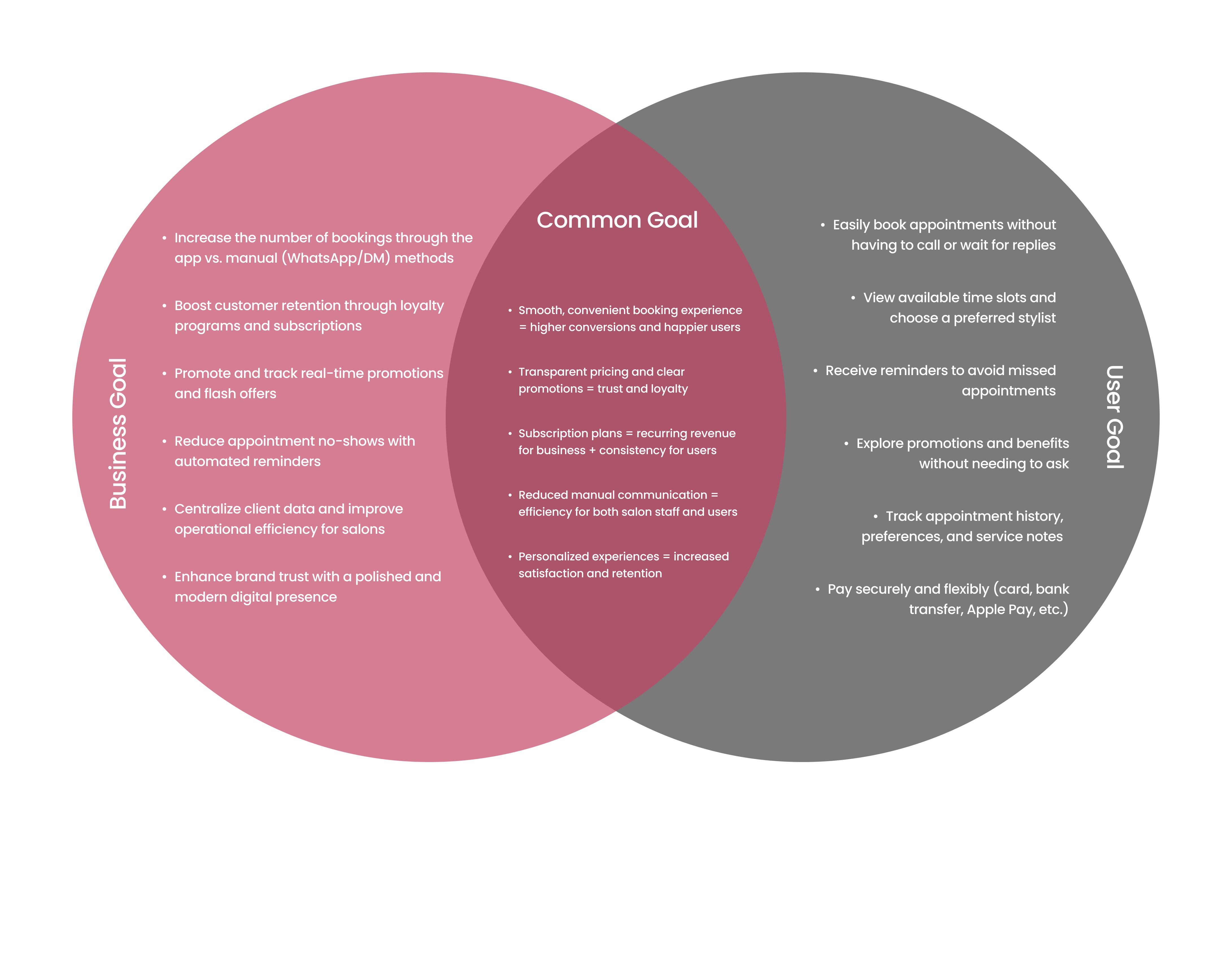
Project Goal
I created this goal alignment map to ensure the Beauty Salon App addressed both user needs and business objectives. Users want an easy, personalized booking experience with flexible payments and reminders. The business needs to boost bookings, reduce no-shows, and improve efficiency through automation and subscriptions. By focusing on their shared goals—like seamless booking, transparent pricing, and personalized experiences—I selected features that create value for both sides. Technical considerations like real-time calendar sync, push notifications, and secure payments support these goals.
Problem Statement
Busy users find it frustrating to schedule beauty appointments through manual channels like WhatsApp or phone calls, as these require waiting for responses, involve back-and-forth communication, and lack real-time availability.
Users often forget their scheduled appointments or promotions due to the absence of automated reminders and centralized updates, leading to missed opportunities for both users and salons.
There is no streamlined way for users to manage recurring beauty routines, preferences, and payments in one place, which limits personalization, loyalty, and consistency in self-care habits..
Booking Made Easy
POV: A tech-savvy and time-constrained user who values eciency and trust in their beauty routine needs a reliable and streamlined way to book appointments with their preferred stylist, without relying on manual coordination over WhatsApp or phone calls.
HMW: How might we streamline the booking process to give tech-savvy, time-constrained users instant access to available time slots and preferred stylists?
Full User Autonomy
POV: A self-reliant and digitally fluent user wants to manage their entire beauty experience—scheduling, payment, and personalization—independently, without relying on back-and-forth messaging or repeated instructions.
HMW: How might we design an entirely self-service platform that empowers users to control their beauty experience end-to-end?
Consistency Through Subscriptions
POV: Users who want to maintain a consistent self-care routine need an easy way to subscribe to regular services, receive perks, and stay on schedule—without needing to manually remember or rebook every month.
HMW: How might we support recurring users with subscription options, personalized reminders, and reward incentives to build long-term habits?
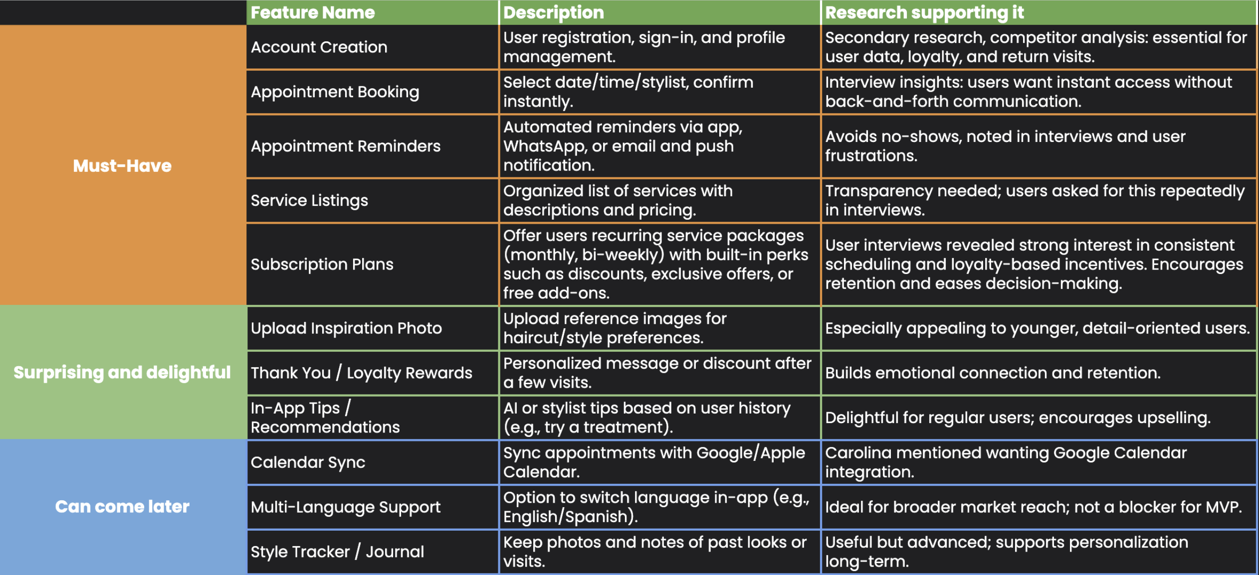
Feature Set
I selected this feature set based on user interviews, competitor analysis, and research. The must-have features focus on core functionality—easy booking, clear service info, reminders, and subscriptions—for a smooth and reliable experience. The delight features add personalization and help build loyalty, like inspiration photo uploads and rewards. The future features are planned to improve convenience and inclusivity, such as calendar sync and language options, but aren't essential for launch. This balance supports both user needs and business goals.
Design
User Flow
- Account creation and login
- Booking an appointment
- Managing a subscription plan
With these insights in mind, I mapped out the user flow covering three key journeys:
From entry to confirmation, I designed every step to feel intuitive, clean, and trustworthy.
Wireframe Low Fidelity
After conducting usability testing with the low-fidelity wireframes, I analyzed the feedback and identified key patterns in what users found helpful, frustrating, or expected from the app. To make sense of all this input and guide my design decisions, I created a MoSCoW prioritization table.
This method helps organize features into four levels of priority:
Must Haves reflect consistent user expectations.
Users wanted a clear 'Book Appointment' button, a monthly calendar view, and a way to organize stylists by the services they offer. These features were repeatedly mentioned as essential for making the app intuitive and easy to use.
Should Haves are features that add flexibility and polish.
Suggestions like letting users skip or change their subscription, or combining homepage actions with special offers, were appreciated but not critical to core functionality.
Could Haves are enhancements based on individual comments.
Some users mentioned features like favoriting a stylist or having a help button for extra support. These ideas are helpful, but less urgent.
Won’t Have (for now) includes features that didn’t meet user expectations.
For example, a week-only calendar view was less useful, as users preferred seeing the full month to plan ahead more effectively.
This MoSCoW table ensures the design evolves with clear priorities based on actual user needs — not assumptions. It helped me focus on improving the features that matter most while leaving room for future enhancements.
Branding
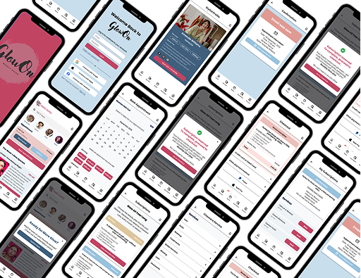
High Fidelity and Prototype
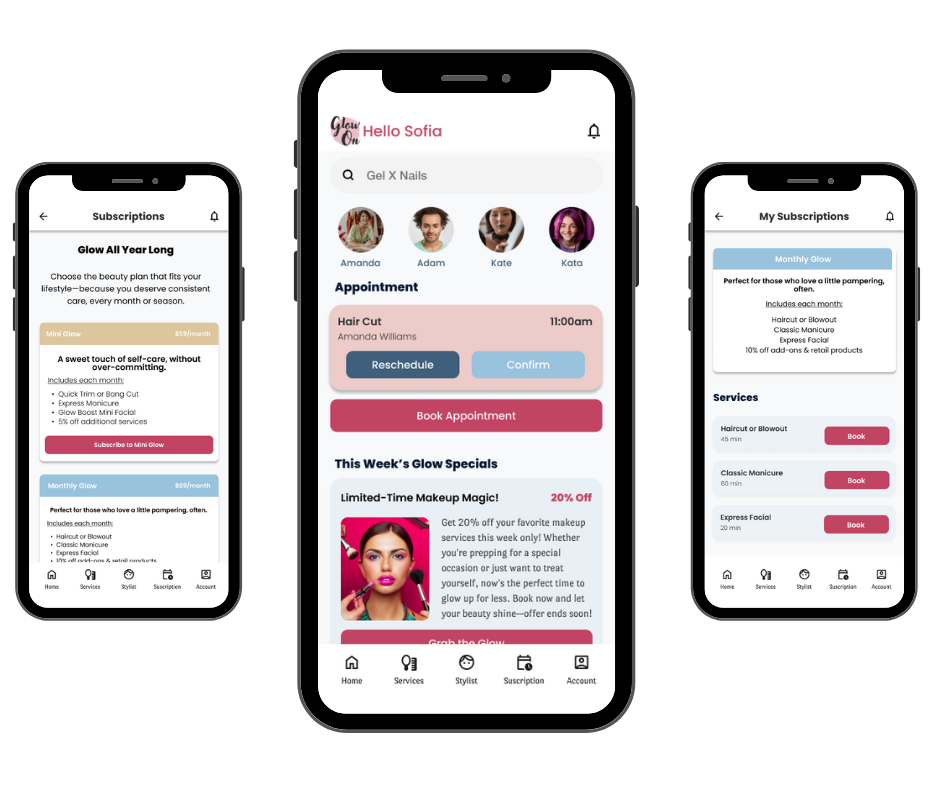
I brought the GlowOn experience to life through high-fidelity wireframes that visualize every key moment of the user journey. From the welcoming onboarding screens that set a friendly, polished tone, to the service booking flow where users can effortlessly explore and select their preferred treatments, each step was carefully crafted for simplicity and clarity.
UI Kit - Design Language System
This UI kit was developed to ensure visual consistency, usability, and scalability across the GlowUp beauty salon app. It reflects the brand's friendly, polished, and modern personality, with clear elements for navigation, interaction, and feedback.
Buttons
The button styles are designed with primary and secondary states, using colors that reflect action urgency (like pink for booking and blue for confirmations). They come in multiple styles—filled, outlined, and disabled—for flexibility across the app.
Cards
Cards are used to display appointment details, payment options, and confirmations in a structured, user-friendly layout. The soft color blocks and clean typography help emphasize key information while keeping the design welcoming and easy to scan.
Small Elements
These include icons, service tags, and social media elements. They add personality and functionality to the interface while keeping the design light and visually consistent.
Navigation
Navigation components include top bars, bottom tab bars, and search. The structure is intuitive, allowing users to easily access booking, services, their account, and history. Personalized greetings ('Hello Sofia') enhance the welcoming, human tone of the app.
-
Testing
-
Participants
5 Users -
Method
Remote moderated sessions -
Test Duration
About 15 minutes per user
-
-
What Went Well
- Users found the app intuitive and visually calming
- The calendar booking flow was a clear favorite
- Subscription value messaging was strong
- The design felt clean and modern
Pain Points
- Some users thought the subscription was complete before payment
- A few didn't notice the subscription tab
- Users wanted clearer comparisons between similar service plans
Iterations
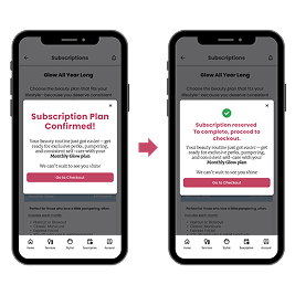
- Why: Users were confused after seeing a “Plan Confirmed” message but not going through payment yet.
- Design Update: I revised the copy to make it clear that payment is still needed — replacing “Plan Confirmed” with “Almost Done: Complete Payment to Activate.”
- Why: Some users didn’t notice the subscription option in the bottom navigation.
- Design Update: I updated the icon and added a label to say “My Plan,” making it easier to recognize.
- Why: Users expected a confirmation after booking or subscribing.
- Design Update: I added both in-app confirmation screens and optional email confirmations to reassure the user and reinforce the completed action.
After testing the GlowOn prototype with 5 users through remote moderated sessions, I reviewed key feedback to identify what worked, where users felt unsure, and how I could improve the design. The final high-fidelity updates focused on refining clarity and reinforcing trust — without disrupting what users already liked.
What Worked
Clean and modern layout: Users loved the clean design and said it made the app feel “trustworthy” and “easy to use.” I maintained this visual language throughout the final version.
Smooth booking flow: The calendar and stylist selection were intuitive for users. One person even described it as feeling like “online shopping.” I kept this experience, just adding a few visual polish touches.
Subscription idea: The concept of a recurring beauty plan with bundled savings was popular, so I continued to highlight this benefit clearly on the plan selection screens.
What I Changed Based on Pain Points
Clearer Subscription Confirmation Messaging
Better Visibility for Subscription Tab
Confirmation and Reassurance Messages
Final Thoughts
The usability test helped validate that the foundation of the app was strong — intuitive, clean, and aligned with user expectations. But it also surfaced small points of friction that, once addressed, made the experience even more trustworthy and polished.
Each design decision in the high-fidelity version of GlowOn is based directly on real user input — not assumptions. That’s what helped make this version more user-friendly, clear, and ready to support real-world use.
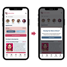
Promotes subscription plans with clear value messaging.
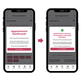
Updated the message to better align with the actual booking flow.
Added an icon to improve clarity and help users understand the process more easily.

Reassures users with a clear email confirmation.
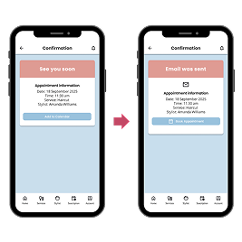
Builds trust by aligning with their need for documentation, and includes icons to enhance clarity and visual guidance.
Final Project and protoype
GlowOn successfully meets user needs for easy salon bookings and flexible subscription plans. Usability tests confirmed the app is intuitive, visually appealing, and functionally smooth with minor areas for improvement.
Challenge Faced:
- Balancing simplicity with detailed service information
Lessons Learned:
- Users seek confirmation and transparency.
- A simple email or status icon goes a long way in building trust.
- Balance is key.
- Simplicity shouldn't come at the cost of information—especially when users are comparing services or plans.
What I'd Do Differently:
- I would add more service detail and plan comparison tools upfront.
What I'm Most Proud Of:
I'm proud of creating an app that's both functional and delightful. GlowOn delivers beauty and convenience in just a few taps—exactly what users were asking for. Hearing testers say things like “It's so clean and easy!” confirmed that I was on the right path.